

Design Process
The design process prioritised refining the user journey to create a seamless, impactful, and intuitive experience across the platform. Key tasks included:
-
1. Structuring Information Hierarchy:
Introduced clear section dividers and icons to categorise elements logically, ensuring users can navigate the content effortlessly. -
2. Optimising Spacing and Alignment:
Established consistent padding, font sizes, and component alignment to create a balanced, polished interface across all screens. -
3. Enhancing Visual Flow: Used visual hierarchy to intuitively guide users through the app, prioritising ease of navigation and fluid interactions.
Aligning System Design with Real-World
Interaction
As part of our UX strategy, we identified and addressed underutilised spaces within the interface. To maintain a clean, purposeful design, these gaps were selectively filled, reinforcing the visual hierarchy. This approach created a balanced composition that directed user focus on core content, resulting in a seamless and engaging experience.
Illustrations to Bridge Gaps
In underutilised areas, I incorporated targeted illustrations, creating a cohesive aesthetic and visual flow across the interface. This not only enhanced usability but also conveyed the brand’s identity in a consistent and engaging way.

Consistency and standards
Issue: The user profile section had a solid foundation but lacked consistency in layout and clarity in information hierarchy, which introduced subtle friction points and impacted user comprehension.
Solution:
-
1. Information Hierarchy: Introduce section dividers and utilize icons to categorize key elements logically.
-
2. Spacing and Alignment: Ensure consistent padding and font sizes across all components.
-
3. User Journey Optimisation: Use visual hierarchy to guide users through the interface intuitively, ensuring a smooth navigation flow.

Key Improvements:
-
1. Strategic use of information hierarchy.
-
2. Effective iconography for segmentation.
-
3. Optimized user journey and seamless interactions.
Aesthetic and Minimalist Design
During the review of the Workout section, we identified that the extensive use of white space created a visually cold experience. To improve the user experience, the design should focus on creating visual balance with warmer tones or inviting elements that promote engagement.
Key Improvements:
-
1. Introduce Warm Visual Elements: Soften the interface with subtle colors.
-
2. Clarify Section Divisions: Use imagery strategically to segment content and improve readability.
-
3. Enhance Design Consistency: Maintain uniformity across all elements to create a more cohesive and friendly user interface.

Suggestions – Improving Consistency: In
the proposed design iteration, I strategically emphasized section division by incorporating images to exemplify each exercise for the user. Through meticulous attention to consistency, I aimed to bring prominence to each section, fostering a more visually cohesive and user-friendly interface.
Key Improvements:
-
1. Sectional Clarity Emphasis.
-
2. Consistency Refinement.
-
3. Prominence for User Engagement.
Elevating UI Design Through Brand Integration

Suggestions: Incorporating the brand into UI design, I utilised the logo as a key element, serving as both an inspiration and a focal point for additional design elements. An example of this approach is the implementation of a counter. However, the design possibilities are extensive, offering various avenues for exploration and expression
Improvements:
-
1. Strategic Brand Integration.
-
2. Inspired Design Elements.
-
3. Functional Example.
Registration steps

The Significance of Onboarding in UX Design

Suggestions: Onboarding serves as a valuable mechanism within UI/UX design, presenting essential information about the fundamental functionality of the application. Beyond its informative role, Onboarding also serves as an avenue to empower users by providing the opportunity to initiate their initial configurations and update user data. This strategic approach not only ensures a smooth introduction to the application but also actively involves users in shaping their individualised experience from the outset.
Onboarding example

Unleashing the Power of a Design System at Habitus Health
Suggestions: In the dynamic world of digital design, the creation and implementation of a Design System stand as a pivotal cornerstone for a brand’s visual consistency and user experience. While Habitus Health currently doesn’t boast a comprehensive Design System, the recent introduction of new colours and a basic UI Kit hierarchy marks an essential step towards establishing a cohesive design language.

-
1. Consistency Across Touchpoints.
-
2. Efficiency in Design Iterations.
-
3. Scalability and Adaptability.
-
4. Enhancing User Experience.
Looking Forward
While the current introduction of new colours and a basic UI Kit sets the groundwork, considering the development of a comprehensive Design System will be instrumental in unleashing the full potential of design at Habitus Health. This strategic investment will not only elevate the brand’s visual identity but also fortify its position as a leader in delivering a seamless and delightful user experience.
Redesigning the Registration Flow From Friction to Clarity
During my analysis of Habitus Health, I identified the registration flow as one of the areas with the greatest potential for improvement. Although functional, it had friction points that could compromise new user conversion rates and the initial perception of the brand.
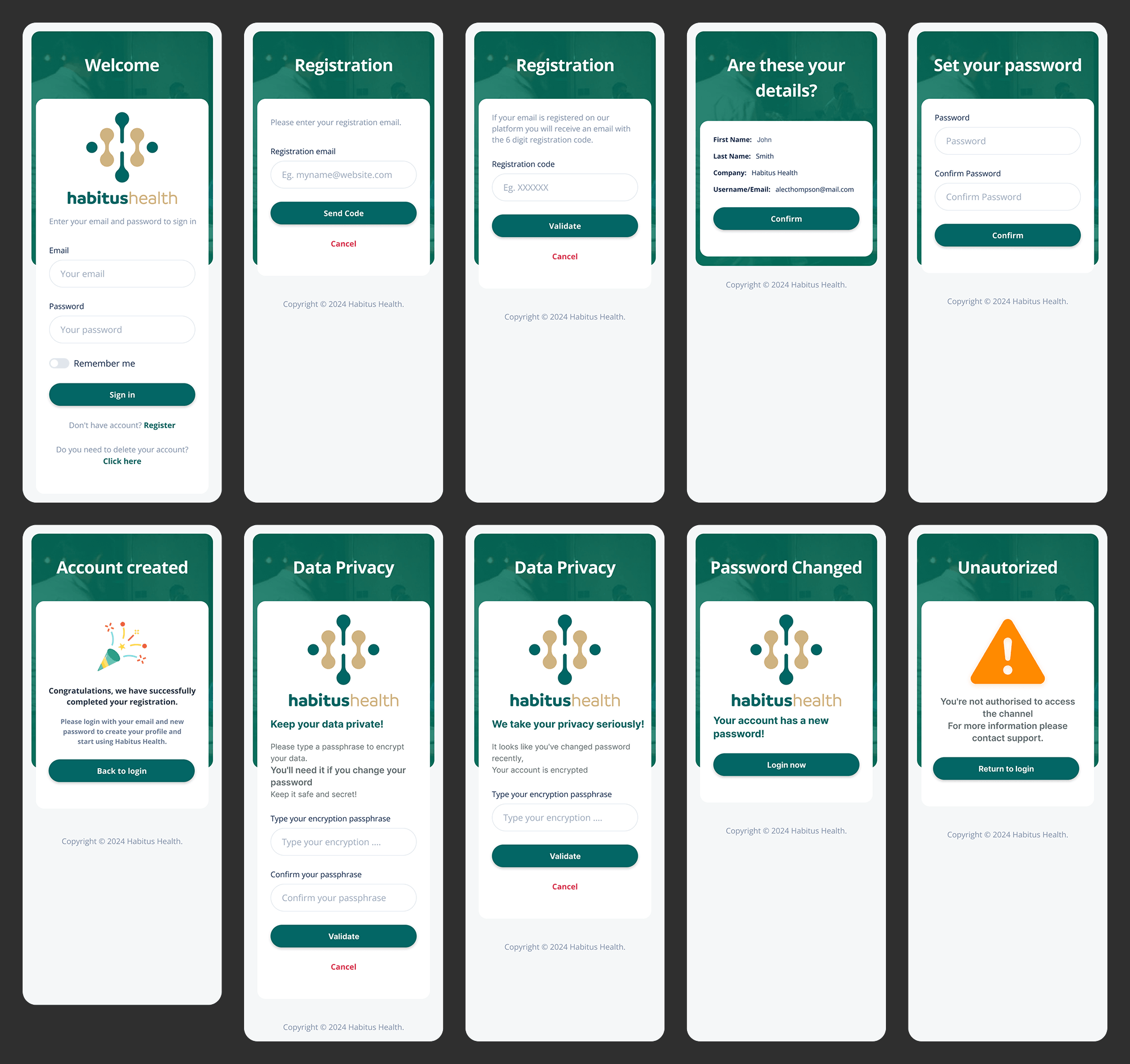
Redesign objectives:
-
Reduce drop-off during registration
-
Communicate security and privacy from the very first contact
-
Create a welcoming yet professional experience
-
Align the flow with the new design system
Redesigning the User Profile with Clarity and Control
The user profile screen is the central hub for personal data, preferences, and account management. My redesign focused on transforming a previously cluttered layout into a clean, scannable interface that puts critical information front and centre while maintaining full alignment with the Habitus Health design system.
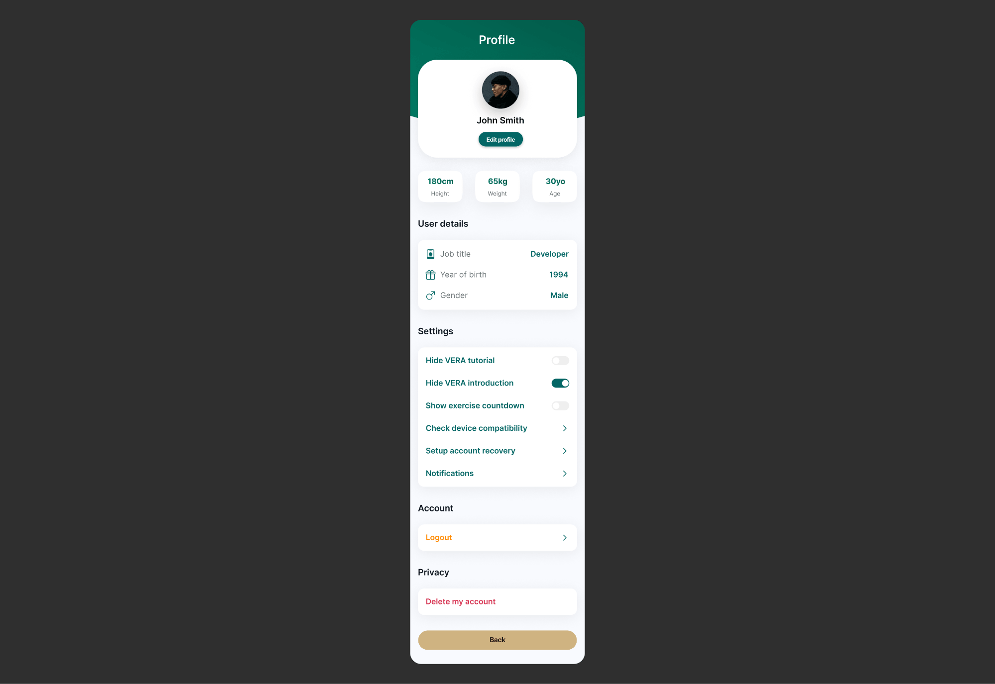
Redesign objectives:
- Organise personal information into logical, scannable sections
- Surface key settings (VERA preferences, device compatibility, recovery options) without overwhelming the user
- Create clear visual separation between profile data, settings and account actions
- Maintain consistency with the design system through spacing, typography and component reuse
Personalised Dashboard with Command Centre for Wellbeing
The dashboard is the most important screen in the application the user’s first daily contact with Habitus Health. My redesign transformed a generic panel into a truly personalised experience, greeting the user by name, displaying their ideal ergonomic measurements and offering clear actions based on each individual’s context.
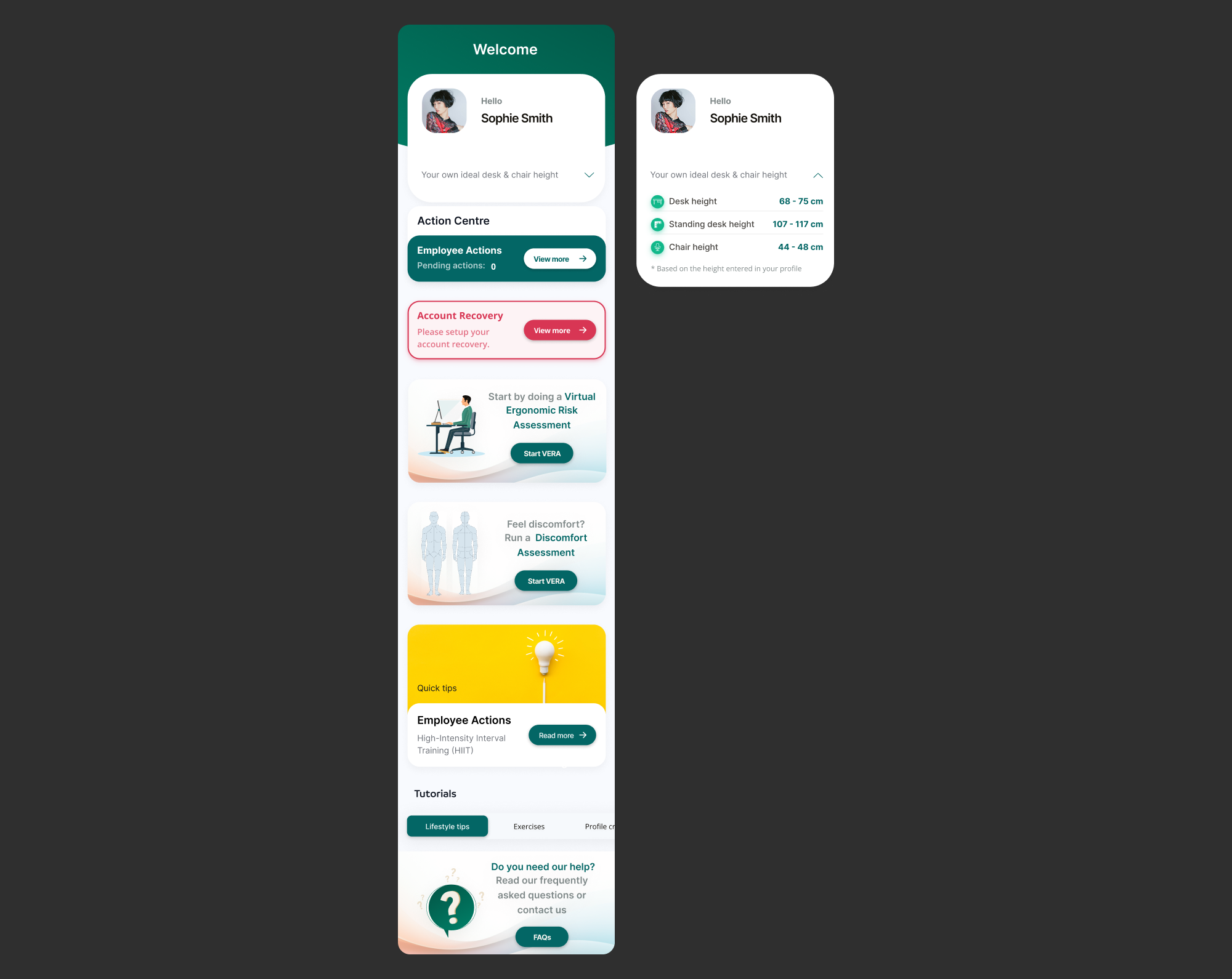
Redesign objectives:
- Create a welcoming and personalised experience from the very first greeting
- Present ideal ergonomic measurements (desk height, standing desk height, chair height) clearly and actionably
- Organise the “Action Centre” with visual priorities: pending actions, account recovery and risk assessments
- Provide easy access to supplementary resources (quick tips, tutorials, FAQs) without cluttering the main interface
The most distinctive element of this dashboard is the display of personalised ergonomic measurements, calculated dynamically based on the height entered in the user’s profile. This transforms abstract data into practical recommendations that users can apply immediately to their workstation.
The “Action Centre” functions as an intelligent priority system: pending employee actions, account recovery alerts and clear calls-to-action for assessments (VERA and discomfort). Each element is designed to naturally guide users towards the next steps in their wellbeing journey.
At the bottom, shortcuts to Quick Tips, Tutorials and FAQs ensure that support and educational content are always just a click away, without visually competing with priority actions.
Workspace Setup to Guiding Users to an Ergonomic Environment
The Workspace Setup screen is a critical educational touchpoint within the Habitus Health experience. My design transformed a dense, text heavy instruction set into a structured, guided process that helps users correctly configure their physical workspace. The screen balances mandatory compliance tracking with clear, actionable ergonomic guidance.
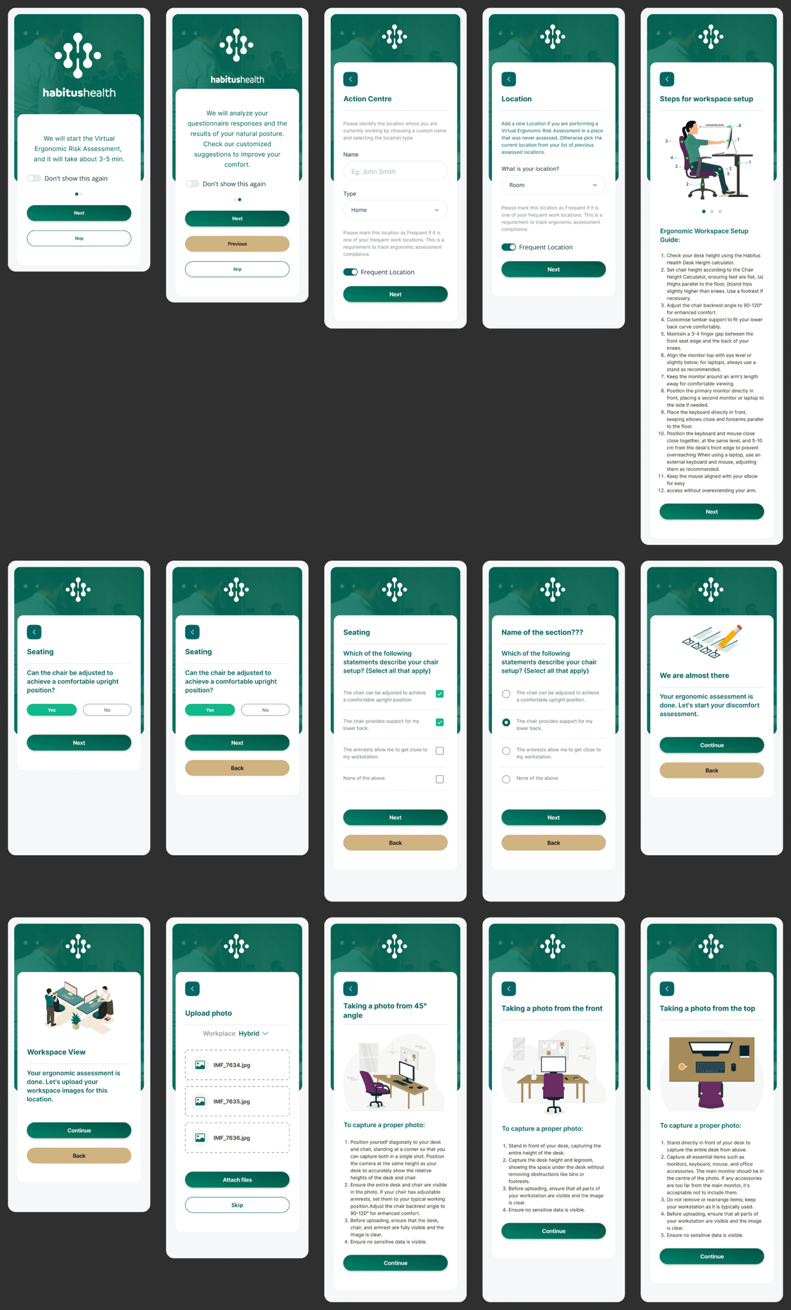
Redesign objectives:
- Introduce the Virtual Ergonomic Risk Assessment (VERA) with clear expectations (3-5 minutes) and an option to suppress future reminders
- Capture essential location data (name, type, frequency) to enable accurate compliance tracking across multiple work environments
- Structure the 12 step ergonomic setup guide into a scannable, numbered checklist that users can follow sequentially
- Maintain visual clarity and consistency with the design system while presenting complex, instructional content
The screen opens with a contextual prompt for the VERA assessment, respecting the user’s time by setting expectations and offering control over future prompts. This small detail reduces friction for returning users while ensuring new users understand the process.
The location identification form addresses a real world complexity: many users work from multiple locations (home, office, remote sites). By allowing custom naming and frequency marking, the design supports accurate compliance reporting without burdening the user with technical jargon.
The 12 step ergonomic guide is the heart of this screen. Originally a dense block of text, it has been reformatted into a numbered list with clear, actionable instructions. Each step focuses on a single adjustment (desk height, chair height, monitor position) making the overall task feel manageable rather than overwhelming. The guide serves both as a setup checklist and a permanent reference users can return to anytime.
Discomfort Assessment with a Guided Journey from Pain to Relief
The Discomfort Assessment is a structured, multi step flow that guides users through reporting and understanding their physical discomfort. My design transformed a clinical questionnaire into an empathetic, visually clear journey that captures essential medical data while providing immediate value through personalised exercise recommendations. The flow balances clinical accuracy with a reassuring, human centred tone.
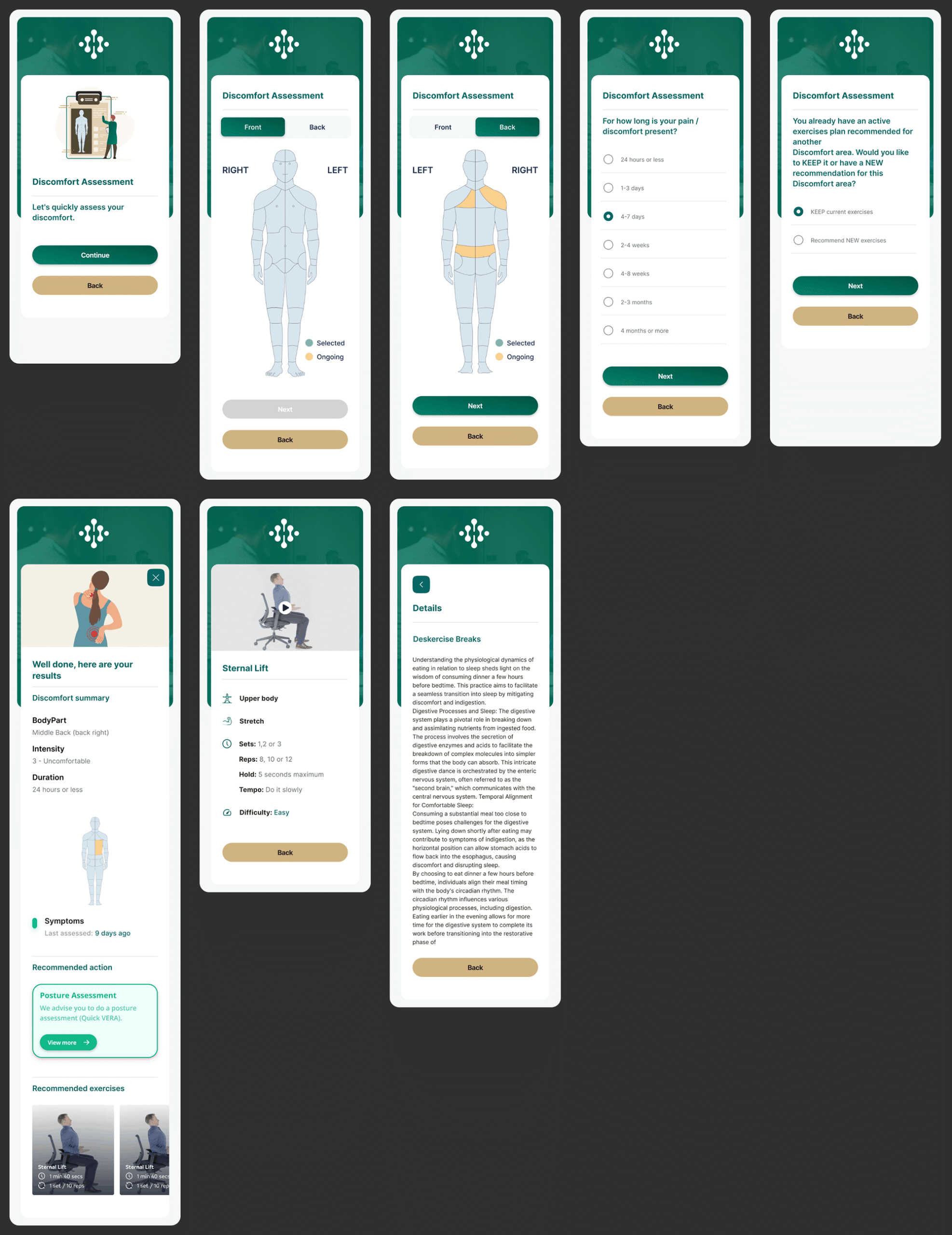
Redesign objectives:
- Create an intuitive body mapping interface that allows precise selection of discomfort areas (front/back views, left/right orientation) with clear visual feedback for selected and ongoing areas
- Capture clinically relevant duration data with a comprehensive but easy to scan range of time options (from 24 hours to 4+ months)
- Handle complex decision logic gracefully when users have existing exercise plans, offering clear choices between keeping current exercises or receiving new recommendations
- Present assessment results in a clean, scannable summary format (body part, intensity, duration) followed by tailored exercise content
- Structure educational exercise content with consistent formatting (sets, reps, hold time, tempo, difficulty) alongside explanatory text about the physiological benefits
The body mapping interface is the centrepiece of the assessment. By offering both front and back views with symmetrical left/right selection, the design captures precise location data without requiring medical terminology from the user. Visual states (selected vs ongoing) provide clear feedback, reducing uncertainty during the reporting process.
The duration question uses a clinically informed range of options, from acute (24 hours or less) to chronic (4 months or more). The radio button layout makes all options visible at once, allowing users to quickly identify their situation without excessive scrolling or dropdown interaction.
A key moment of intelligence in the flow occurs when the system detects an existing exercise plan for a different discomfort area. Rather than silently overriding the user’s previous plan, the design presents a clear choice: “KEEP current exercises” or “Recommend NEW exercises”. This respects the user’s agency while guiding them toward the most appropriate clinical outcome.
The results screen provides an immediate summary of the assessment (body part, intensity, duration) before presenting specific exercises. Each exercise card follows a consistent structure: name, category (e.g. Upper body, Stretch), detailed parameters (sets, reps, hold time, tempo, difficulty), and educational context explaining why the exercise helps. The long form educational content about digestive dynamics demonstrates how the design accommodates deeper explanatory text without becoming overwhelming, using clear typographic hierarchy to maintain readability.
Early Morning Session, Kickstarting the Day with Guided Movement
The Early Morning Session screen curates a short, focused workout routine designed to help users begin their day with gentle, ergonomically beneficial movement. My design presents a sequence of exercises in a clean, card based layout that balances motivational energy with clear instructional detail. Each exercise card provides at a glance information about duration, category, and key parameters, while maintaining a consistent visual rhythm that makes the routine feel cohesive and achievable.
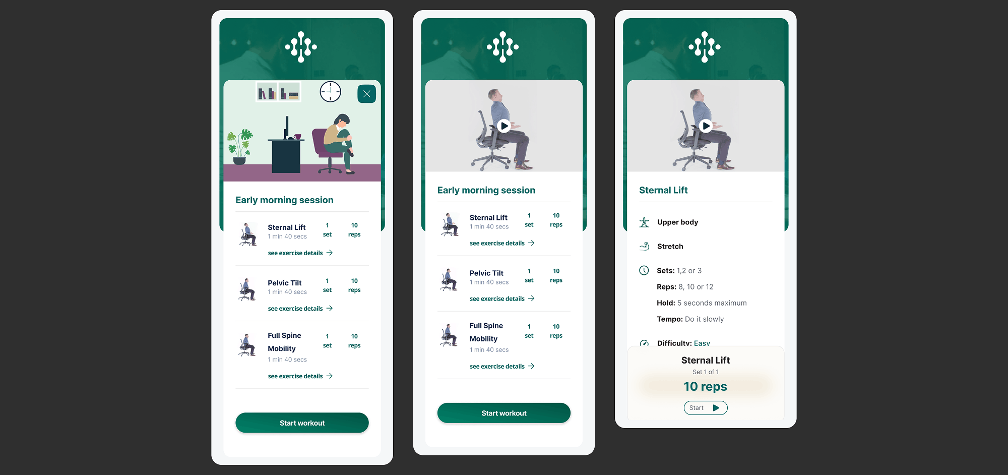
Redesign objectives:
- Present a curated sequence of morning exercises (Sternal Lift, Pelvic Tilt, Full Spine Mobility) in a clear, visually consistent format
- Display essential information at a glance: exercise name, duration (e.g. 1 min 40 secs), and intuitive navigation to detailed views (“see exercise details”)
- Structure detailed exercise parameters consistently: category (Upper body, Stretch, Mobility), sets/reps configuration, hold time, tempo, and difficulty level
- Provide a clear primary action (“Start workout”) that initiates the session, with secondary visibility of the current set (e.g. Set 1 of 1, 10 reps)
- Maintain visual energy and motivation appropriate for a morning routine while adhering strictly to the Habitus Health design system
The screen opens with the session title “Early morning session” followed by a horizontally scrollable or vertically stacked list of exercises. Each exercise card prominently features the name, total duration, and a clear call to action (“see exercise details”) that maintains context without forcing navigation away from the overall routine. This approach allows users to preview the full session while having the option to dive deeper into any specific exercise.
When expanded or viewed in detail, each exercise reveals its complete parameter set. The design uses a consistent vocabulary for these details: category labels (Upper body, Stretch), set and repetition ranges (Sets: 1,2 or 3 | Reps: 8,10 or 12), hold duration (Hold: 5 seconds maximum), tempo guidance (Tempo: Do it slowly), and difficulty rating (Difficulty: Easy). This consistency builds user confidence and reduces the learning curve across different exercises.
The primary action button “Start workout” is prominently positioned, with contextual awareness shown through the set indicator (e.g. “Set 1 of 1, 10 reps” for the Sternal Lift). This subtle detail prepares the user for exactly what they will do first, reducing uncertainty at the moment of starting. The overall design transforms what could be a dense instruction set into an inviting, energising morning ritual that encourages daily engagement.
Quick Tips and Bite Sized Wellness Knowledge at Your Fingertips
The Quick Tips screen serves as a curated knowledge hub within Habitus Health, delivering accessible, bite sized wellness insights across multiple dimensions of health. My design organizes diverse topics from exercise techniques to sleep hygiene into a clean, scannable interface that encourages exploration while making complex health information immediately digestible. The layout balances educational depth with the “quick” promise, giving users both an overview and the option to dive deeper.
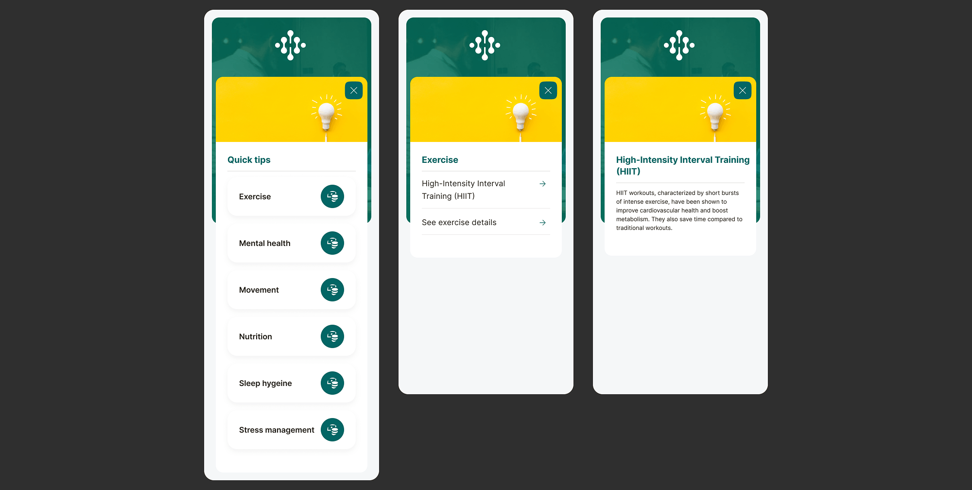
Redesign objectives:
- Create a visually organised directory of wellness topics, categorised into clear themes: Exercise, Mental health, Movement, Nutrition, Sleep hygiene, and Stress management
- Present each topic with a compelling preview that balances scientific credibility with accessibility for example, explaining HIIT workouts in a single, readable paragraph
- Provide clear pathways to deeper content through “See exercise details” calls to action, maintaining the “quick” nature of the overview while supporting further learning
- Establish visual hierarchy that guides users naturally from one category to the next, encouraging exploration across the full spectrum of wellbeing topics
- Maintain strict alignment with the Habitus Health design system while using subtle visual cues (like featured images or icons) to differentiate content categories
The screen is structured around a grid or list of wellness categories, each introduced with a clear heading (Exercise, Mental health, Movement, etc.). The design gives visual prominence to featured content, such as the detailed explanation of High Intensity Interval Training (HIIT). Here, a short, impactful description communicates the core benefit: “HIIT workouts, characterized by short bursts of intense exercise, have been shown to improve cardiovascular health and boost motivation while saving time compared to traditional workouts.” This format respects the user’s time while delivering genuine educational value.
Each category card or section includes an inviting call to action (for example, “See exercise details”) that leads to more comprehensive content without cluttering the main Quick Tips view. This progressive disclosure pattern is essential it preserves the screen’s purpose as a rapid reference tool while acknowledging that some users will want to explore topics in greater depth. The consistent placement of these CTAs builds user confidence and predictability.
The visual design uses the Habitus Health colour palette and typography to create subtle distinctions between categories while maintaining overall cohesion. For instance, the Exercise section might use slightly more dynamic imagery or iconography, while Sleep hygiene adopts calmer visual cues. This nuanced approach guides the user’s emotional response and helps them intuitively find content matching their current needs. The result is a knowledge hub that feels both comprehensive and effortlessly navigable, encouraging users to return regularly as part of their wellness journey.
Tutorials to Empowering Users Through Guided Learning
The Tutorials screen serves as a comprehensive learning hub within Habitus Health, offering users step by step guidance on key platform features and workflows. My design organizes essential instructional content into a clean, accessible list format that helps users help themselves, reducing support queries while increasing confidence and platform adoption. Each tutorial entry provides a clear, action oriented title that sets accurate expectations for the content ahead.
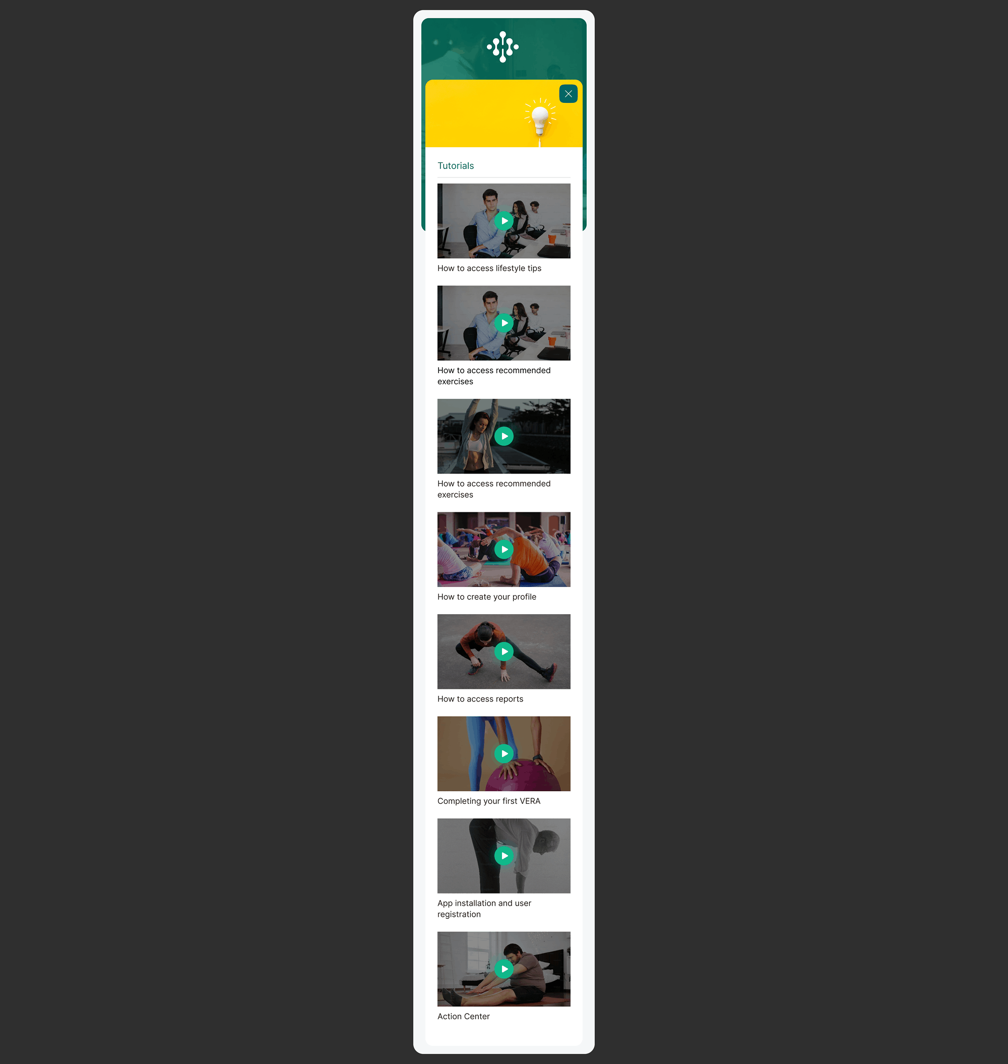
Redesign objectives:
- Create a centralized, easily navigable directory of all tutorial content, covering the full spectrum of user needs from initial setup to advanced feature usage
- Structure tutorials into logical categories covering: lifestyle tips, recommended exercises, profile creation, reports access, first VERA completion, app installation, and Action Center navigation
- Use clear, action oriented language in tutorial titles (e.g. “How to access lifestyle tips”, “Completing your first VERA”) that accurately describes the content and builds user confidence
- Provide consistent visual treatment for each tutorial entry, making the list scannable and reducing cognitive load when searching for specific guidance
- Maintain full alignment with the Habitus Health design system while ensuring the tutorial interface feels supportive and educational rather than technical or intimidating
The screen presents tutorials in a vertically scrolling list, with each entry clearly delineated by a touch friendly container and a prominent arrow or “>” indicator signaling that more content is available. This consistent visual pattern trains users to recognize tutorials as actionable items, building predictability across the learning experience.
The tutorial titles are crafted to be both specific and encouraging. “How to access lifestyle tips” sets a clear expectation of outcome, while “Completing your first VERA” acknowledges the user’s journey milestone with a supportive tone. This careful choice of language reduces anxiety around new or complex features and encourages exploration.
The content hierarchy reflects the user’s likely learning journey. Early tutorials cover fundamentals: “App installation and user registration” and “How to create your profile”. Mid journey tutorials introduce core wellness features: “How to access recommended exercises” and “Completing your first VERA”. Later topics cover ongoing engagement: “How to access reports” and “Action Center”. This implicit progression guides users naturally from onboarding to regular platform use without overwhelming them with choices.
By consolidating all guidance in one intuitive location, the Tutorials screen transforms what could be scattered support documentation into a cohesive, user friendly learning resource. This approach not only improves the user experience but also reduces support team workload by empowering users to find answers independently.
Helpful Answers with a Multi Layer Support Hub for User Independence
The Helpful Answers screen functions as a comprehensive support centre within Habitus Health, designed to resolve user queries through multiple pathways before they need to contact support. My design structures help content across three integrated layers: immediate answers to frequently asked questions, topic based browsing categories, and a streamlined contact form for unresolved issues. This layered approach empowers users to find solutions independently while ensuring human support remains accessible when needed.
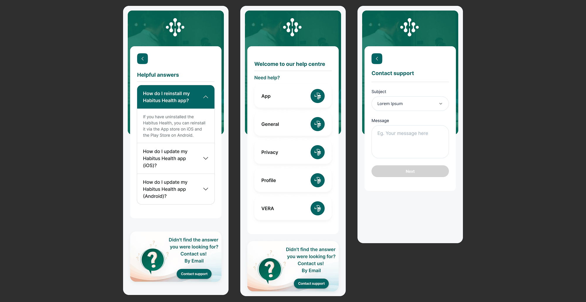
Redesign objectives:
- Create a three tier help structure: direct FAQs, categorical browsing, and contact form each serving different user needs and urgency levels
- Present frequently asked questions with clear, expandable answers covering common topics like app reinstallation and platform specific updates (iOS/Android)
- Organise help centre topics into intuitive categories (App, General, Privacy, Profile, VERA) that mirror the application’s information architecture
- Provide a seamless transition from self service to human support through the “Contact support” form, capturing essential information (Subject, Message) without overwhelming the user
- Maintain consistent visual language with the Habitus Health design system while ensuring the help interface feels approachable and supportive
The screen opens with a “Helpful answers” section featuring specific, actionable FAQs. Each question (e.g. “How do I reinstall my Habitus Health app?”) is followed immediately by a concise, helpful answer directly below. This format respects the user’s time by delivering value instantly without requiring additional clicks. The inclusion of platform specific guidance (iOS vs Android update instructions) demonstrates attention to the user’s technical context.
The middle section, “Welcome to our help centre”, presents topic categories as clear, tappable options. By organising help content into App, General, Privacy, Profile, and VERA categories, the design aligns with how users mentally model the application. A user with a profile issue knows exactly where to navigate, reducing the cognitive load of searching through generic help documentation.
The “Didn’t find the answer you were looking for?” prompt acts as a thoughtful bridge between self service and human support. Rather than leaving users frustrated, the design proactively offers the “Contact us! By Email” pathway. The subsequent contact form is deliberately simple, asking only for Subject and Message before the “Next” action. This low friction approach encourages users to reach out when needed, while structured fields ensure support teams receive actionable information.
Throughout the screen, careful typography and spacing create a calm, supportive tone appropriate for moments when users may already be experiencing frustration. The design transforms what could be a stressful support experience into an organised, reassuring process that reinforces user confidence in the Habitus Health platform.
My Exercises with Personalised Workout Management at Your Fingertips
The My Exercises screen serves as the central hub for all workout activity within Habitus Health, combining session planning, exercise discovery, and detailed workout management in a single, intuitive interface. My design organizes complex scheduling data, exercise libraries, and session states into a clean, scannable layout that empowers users to take control of their ergonomic exercise routines. The screen balances immediate actions like starting a workout with longer term planning through the weekly calendar view.
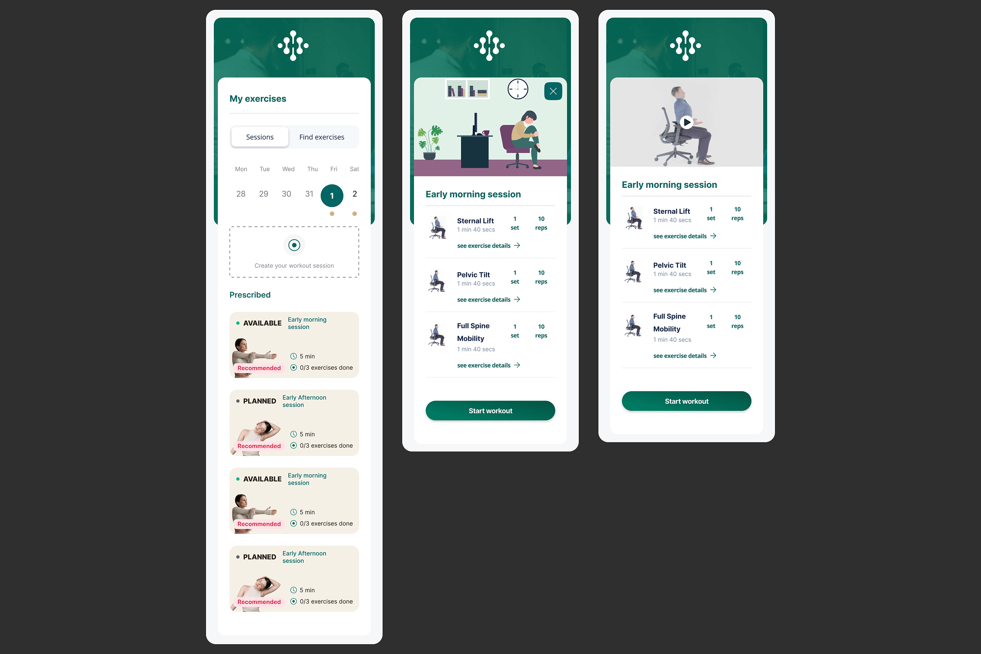
Redesign objectives:
- Create a dual tab structure (“Sessions” and “Find exercises”) that separates planned routines from exercise discovery, reducing cognitive load
- Integrate a weekly calendar view (Mon to Sun with dates) that provides temporal context and helps users plan their workout week
- Organize sessions into clear state categories: “Prescribed” (professionally recommended), “AVAILABLE” (ready to start), and “PLANNED” (scheduled for future)
- Present exercise details within each session using consistent cards showing: exercise name (Sternal Lift, Pelvic Tilt, Full Spine Mobility), sets/reps configuration (e.g. “1 10”), duration (1min 40secs), and a consistent “see exercise details” call to action
- Provide clear primary actions per session: “Start workout” buttons with progress indicators (e.g. “0/3 exercises done”) and total duration (e.g. “5min”)
- Maintain strict visual consistency with the Habitus Health design system while ensuring the dense information remains scannable and approachable
The screen opens with a clear header “My exercises” and a dual tab navigation (“Sessions” and “Find exercises”) that allows users to toggle between their planned routines and the broader exercise library. Below this, a weekly calendar displays the current week (Mon Tue Wed Thu Fri Sat) with dates (28, 29, 30, 31), giving users immediate temporal context for their workout planning.
The main content area organizes sessions into meaningful categories. The “Prescribed” section highlights professionally recommended workouts, establishing trust and guiding users toward clinically sound routines. Below this, sessions are further classified as “AVAILABLE” (ready to be started) and “PLANNED” (scheduled for future days). Each session card displays its name (e.g. “Early morning session”), total duration, and a progress indicator showing completed exercises (e.g. “0/3 exercises done”) alongside the primary “Start workout” button.
When expanded, each session reveals its constituent exercises presented as individual cards. Every exercise card follows a strict, consistent format: name (Sternal Lift, Pelvic Tilt, Full Spine Mobility), a compact visual representation of sets and reps (e.g. “1” and “10” in circular indicators), duration (1min 40secs), and the ubiquitous “see exercise details” link. This consistency means that once users learn to read one exercise card, they can parse any exercise across the entire application without relearning.
The design also includes a “Create your workout session” call to action, empowering users to move beyond prescribed routines and build custom sessions tailored to their specific needs. Throughout the screen, careful use of spacing, typography, and visual hierarchy transforms what could be overwhelming scheduling and exercise data into an organised, confidence inspiring tool that makes regular ergonomic exercise feel achievable and well managed.
Assessment Summary with Comprehensive Dashboard of Ergonomic Progress
The Assessment Summary screen serves as the consolidated progress dashboard within Habitus Health, bringing together ergonomic assessment results, actionable recommendations, historical data, and follow up tracking in a single, information rich interface. My design synthesizes complex clinical data from multiple sources into a structured, scannable view that helps users understand their ergonomic status, prioritize improvements, and track their progress over time. The screen balances dense information with clear visual hierarchy to prevent overwhelming the user.
Redesign objectives:
- Create a unified dashboard that aggregates data from multiple sources: VERA assessments, discomfort reports, employee actions, and ergonomic recommendations
- Present a clear “Ergonomic summary” with risk levels (High, Minimal, Moderate, Low) across key categories like Scaling, Computer, Keyboard and Mouse, and Accessories
- Structure the “Action Centre” to highlight pending employee actions, baseline requirements, and document visibility with clear visual indicators
- Display detailed recommendations with clinical rationale (“Why”) and practical implementation guidance (“How?”), including temporary solutions for immediate relief
- Incorporate follow up tracking through scaling questions (“Have you been able to implement an ergonomic change?”) to close the feedback loop
- Provide historical context through “VERA History” showing location based assessments (Home/Room) with completion status and a timeline view
- Include a “Discomfort overview” showing last assessment date, body area (Lower Back), and open cases to maintain continuity of care
The screen opens with a personalized greeting (“Good morning, John”) followed by a high level “Ergonomic summary” that uses clear risk labels (High risk, Minimal risk, Moderate risk, Low risk) across workplace categories. This gives users an immediate, at a glance understanding of their current ergonomic status without needing to interpret raw data.
The “Action Centre” consolidates pending tasks, including employee actions like adjusting elbow height and strategic weeks planning. Each action includes baseline requirements and visual indicators, transforming what could be an overwhelming to do list into a structured, prioritised set of next steps. Below this, specific questions from the VERA assessment are presented with the user’s previous answers, maintaining context for ongoing recommendations.
Recommendations are presented in a detailed yet accessible format. Each recommendation (e.g. “Have the workstation surface at your elbow height”) includes a “Why” section explaining the clinical rationale and a “How?” section with practical steps. The inclusion of “Temporary Solution” guidance demonstrates empathy for users who cannot immediately implement full ergonomic changes, offering practical alternatives like adjusting chair height or using phone breaks.
The screen incorporates a feedback mechanism through scaling questions asking whether users have implemented recommended changes. This creates a closed loop system where recommendations are not just delivered but their effectiveness is tracked. The “Discomfort overview” section maintains continuity by showing the last assessment date, affected body area, and any open cases, ensuring that ongoing issues are not lost in the dashboard.
Finally, the “VERA History” section provides temporal context, showing assessments by location (Home, Room) with completion status (Fully assessed, Partially assessed, Not assessed) and a timeline view. An “Ergonomics score” tracks progress over time, giving users a measurable sense of improvement. Throughout this dense screen, careful use of spacing, typographic hierarchy, and consistent visual language transforms complex clinical and administrative data into an empowering tool for ergonomic self management.
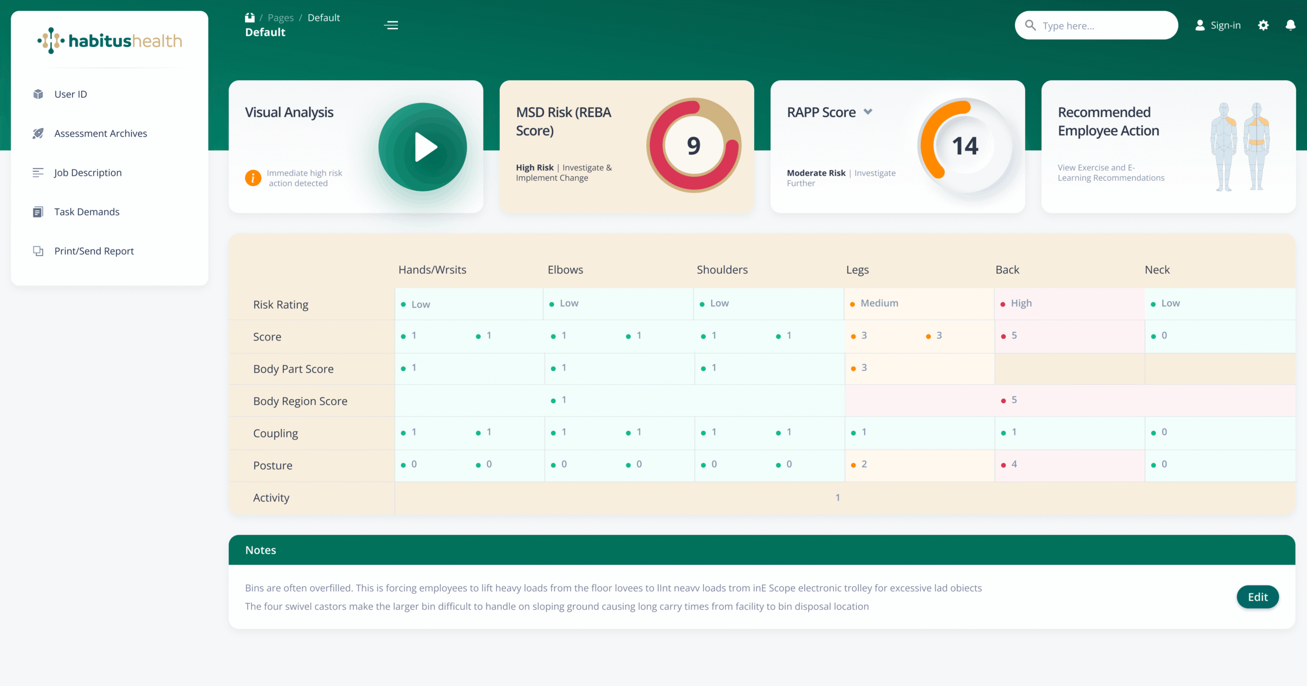
Ergonomic Dashboard with Comprehensive Risk Assessment at a Glance
The Ergonomic Dashboard serves as the primary analytical interface within Habitus Health, designed for workplace safety professionals and managers to monitor, assess, and act on ergonomic risks. My design synthesizes complex biomechanical data from multiple assessment methodologies (REBA, RAPP) into a clear, action oriented view. The screen balances high level risk indicators with detailed body part scores, enabling quick identification of critical issues while providing the depth needed for thorough analysis.
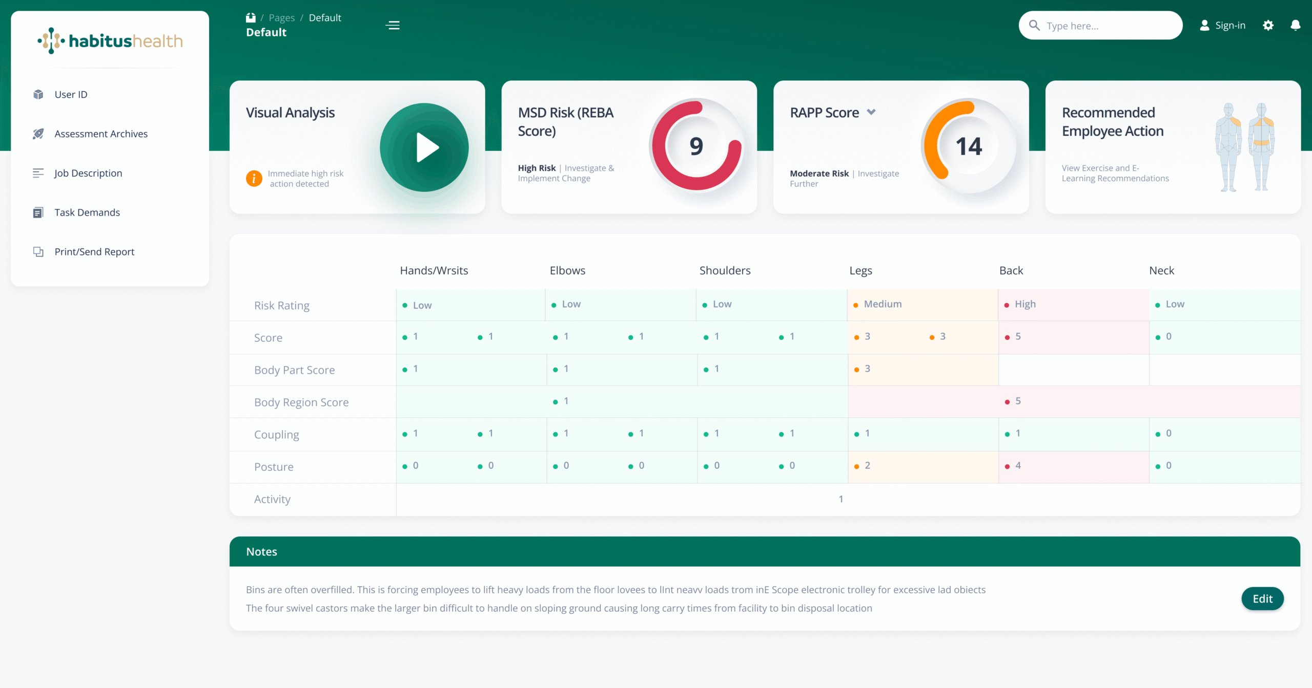
Redesign objectives:
- Create a unified dashboard header with key user and context identifiers: User ID, Assessment Archives, Job Description, Task Demands, and Print/Send Report functions
- Present a prominent “Visual Analysis” alert for immediate high risk actions, ensuring critical issues cannot be overlooked
- Display standardized risk scores (MSD Risk/REBA Score and RAPP Score) with clear categorical outcomes: “High Risk | Investigate & Implement Change” and “Moderate Risk | Investigate Further”
- Provide a quick link to “View Exercise and E-Learning Recommendations” directly from the dashboard, connecting risk identification with intervention
- Structure a detailed body part matrix covering Hands/Wrists, Elbows, Shoulders, Legs, Back, and Neck with consistent metrics: Risk Rating (Low, Medium, High), Score, Body Part Score, Body Region Score, Coupling, and Posture
- Include a “Notes” section for contextual observations, enabling practitioners to document specific workplace factors (e.g., bin overfilling, castor difficulties on sloping ground)
The screen is anchored by a clear header providing access to essential administrative functions: Assessment Archives for historical data, Job Description and Task Demands for context, and Print/Send Report for documentation and sharing. This ensures that all tools needed for comprehensive assessment are available from a single location.
The “Visual Analysis” alert dominates the upper section, using clear language (“Immediate high risk action detected”) to demand attention. Below this, standardized risk scores are presented with unambiguous action directives. The REBA Score of 9 triggers “High Risk | Investigate & Implement Change”, while the RAPP Score of 14 indicates “Moderate Risk | Investigate Further”. This dual score approach provides both immediate urgency and nuanced risk stratification.
The body part matrix is the analytical core of the dashboard. For each region, practitioners can see at a glance the Risk Rating (colour coded Low, Medium, High), numerical scores, and additional metrics like Coupling and Posture that contribute to the overall assessment. The Back region, for example, shows High Risk with a Score of 5, while Legs show Medium Risk, enabling targeted intervention prioritisation. Consistent formatting across all body parts ensures rapid cross comparison.
The integrated “Notes” section captures real world context that quantitative scores cannot convey. Detailed observations about bin overfilling, swivel castor difficulties on sloping ground, and long carry times provide essential qualitative data that informs practical, context aware recommendations. This combination of quantitative risk scores and qualitative workplace insights creates a powerful tool for evidence based ergonomic intervention.
This variation of the dashboard emphasizes the granular scoring data, with expanded visibility of individual Body Part Scores and Body Region Scores. The matrix reveals, for example, that the Back region carries a Body Part Score of 3, while other regions score 1, providing precise numerical justification for the High Risk classification. The Posture scores (0 for most regions, but 2 for Back and 4 for Neck) highlight specific biomechanical factors contributing to overall risk.
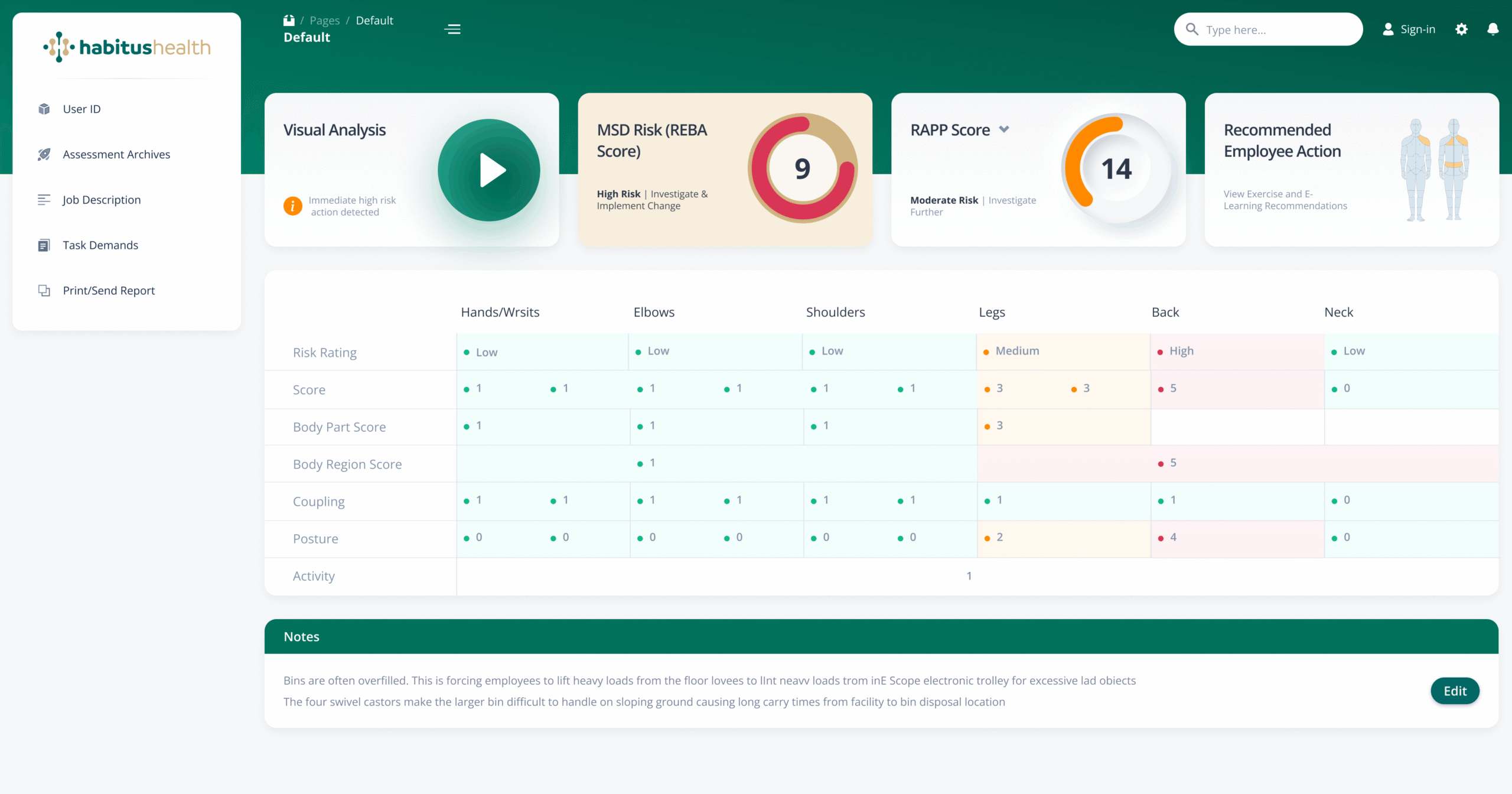
This dashboard view maintains the complete scoring matrix while demonstrating the system’s flexibility. The consistent data structure across views ensures that safety professionals can rely on familiar layouts and metrics regardless of which dashboard variation they are using. The Notes section persists across views, ensuring that critical contextual information remains visible alongside quantitative data.
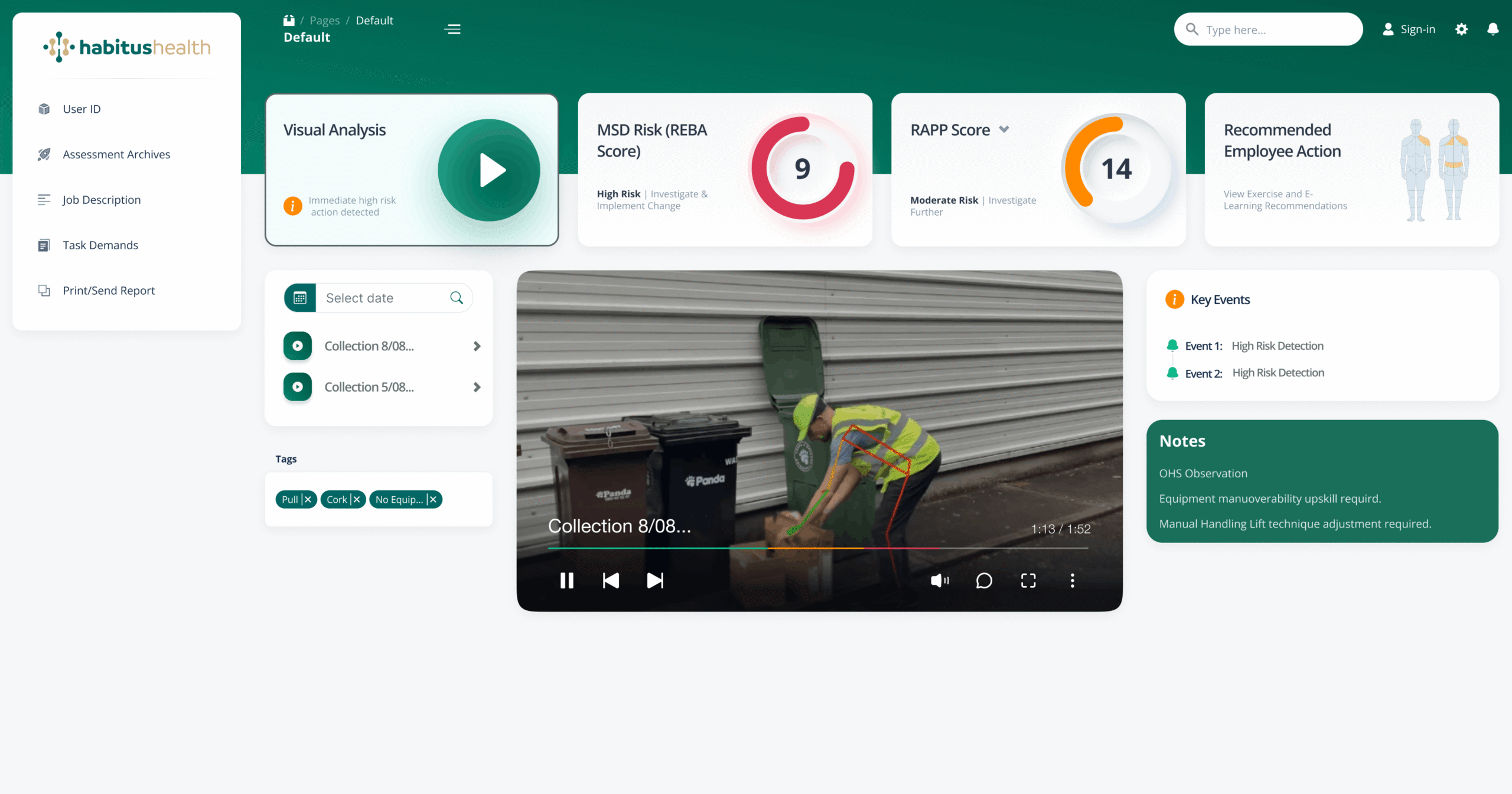
This timeline oriented dashboard view introduces a temporal dimension to risk management. A date selector allows practitioners to focus on specific periods, while “Key Events” track notable incidents such as “Event 1: High Risk Detection” on Collection 8/08. The tagging system (OHS Observation, PullX, CorkX) enables categorization and filtering of observations. Notes are now linked to specific events and collections, with actionable insights like “Equipment manoeuvrability upskill required” and “Manual Handling Lift technique adjustment required” directly associated with their source events.
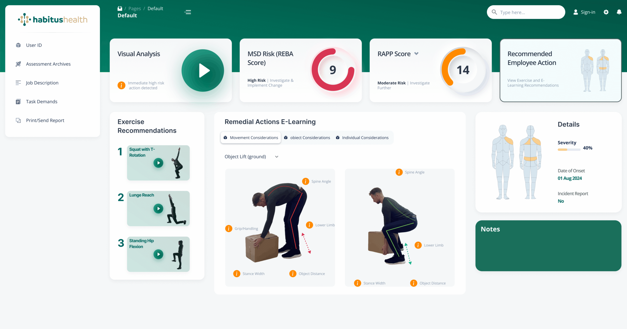
Exercise and E-Learning Recommendations:
This screen translates risk assessment data into actionable interventions. Following the “View Exercise and E-Learning Recommendations” link from the main dashboard, practitioners access targeted exercises matched to identified risks. Each recommendation includes specific movement considerations: “Squat with T Rotation” for Object Lift (ground), “Lunge Reach” addressing Spine Angle and Lower Limb, and “Standing Hip Flexion” focusing on Grip/Handling, Stance Width, and Object Distance. Remedial Actions and E-Learning content provide structured pathways for risk mitigation, while the Details panel captures Severity (40%), Date of Onset, and Incident Report Number for comprehensive case management.
3D Simulation and Image Processing Workflow at Habitus Health
1. Creating and Exporting the Simulation in Blender: To ensure ergonomic accuracy, we developed a 3D avatar in Blender, articulating correct postures for the workplace. Using Python automation, multiple cameras were positioned in circular layers to capture various angles effortlessly.ssential step towards establishing a cohesive design language.

2. Batch Exporting the Rendered Images:
The rendered images are batch-exported using custom scripts, ensuring high quality and transparency. This automation streamlines the capture process without manual effort.


3. Image Processing with PHP: Once each exerciseexported, a PHP web tool resizes, rotates, and optimizes the images to maintain quality and compress the files. This ensures smooth integration across the Habitus Health platform.

The Importance of This Feature for Users
This 3D simulation feature offers an immersive and user-friendly way to educate users on ergonomically correct postures. It promotes well-being by guiding posture correction visually, supporting compliance with occupational health standards. This enhances the user experience while fostering healthier workplace habits.
Habitus Health Logo Evolution From 2D to 3D Design
This section showcases the creative process behind the Habitus Health logo, transitioning from a flat 2D concept to a 3D render using Spline Design. Each step reflects the brand’s commitment to innovation and well-being through modern and organic aesthetics.
1. 2D Logo Creation
The initial design explores soft shapes and colors aligned with the brand’s identity.
2. 3D Modeling and Rendering
Using Spline Design, the logo gains depth and volume, reinforcing the brand’s digital presence and offering flexibility for interactive applications.
Why This Design Matters for User Experience
A well-crafted logo fosters emotional connections with users and builds trust, aligning with Habitus Health’s mission to promote well-being. The 3D version also opens new opportunities for animations and interactive experiences, enhancing user engagement.
Conclusion
-
1. Onboarding Screens: Five screens focused on assessments, insights, and compliance.
-
2. Design System: Emphasized the importance of a unified visual language.
-
3. User Flow Optimisation: Improved navigation and consistency for better user satisfaction.
-
4. 3D Simulation: Enhanced user engagement through ergonomic posture modeling.
-
5. Brand Identity: Strengthened through logo evolution and consistent visual design.